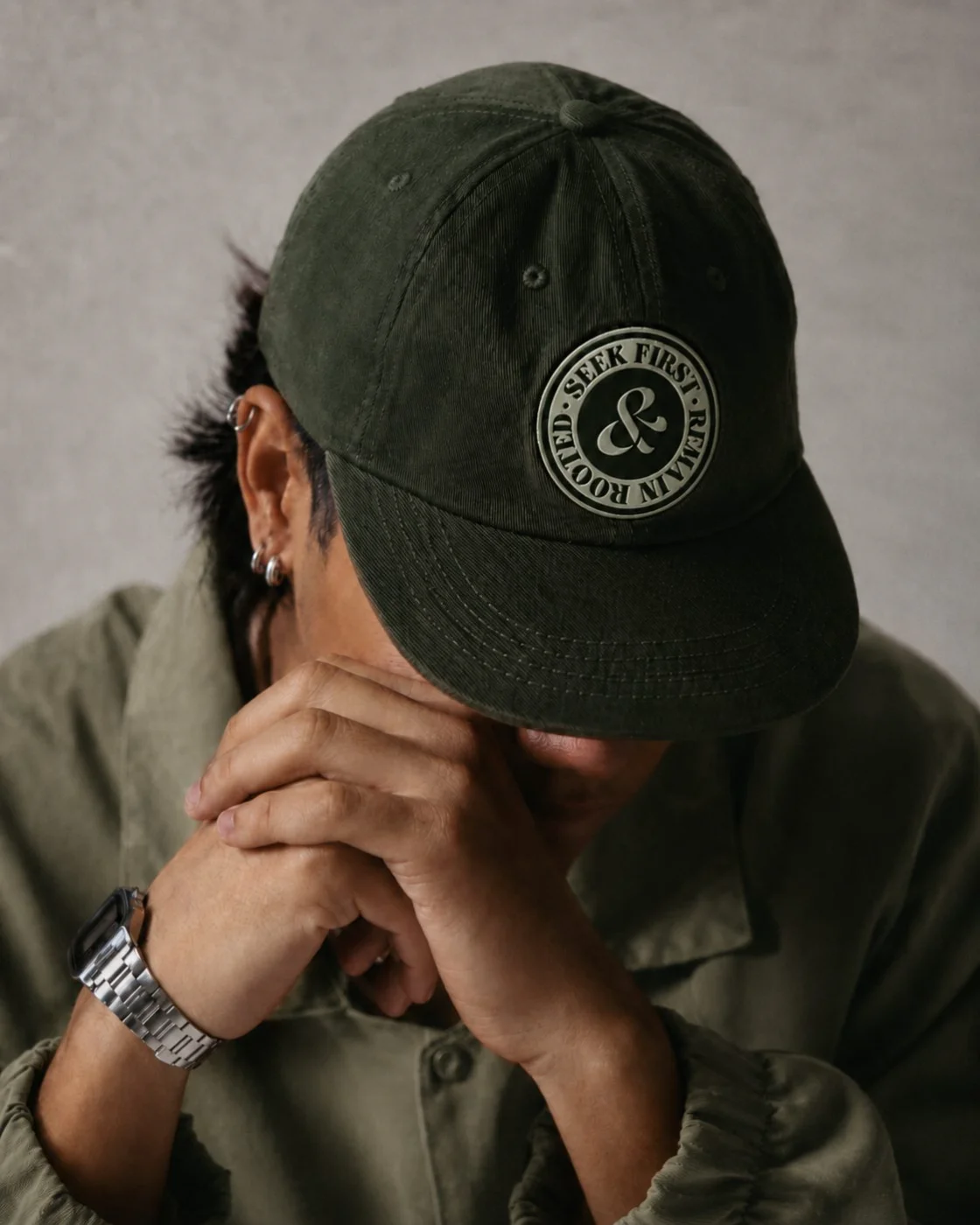
A faith-based apparel label built on a single character — a custom ampersand drawn by fusing the brand's own S and R.
Logo DesignBrand IdentityTypographyApparel
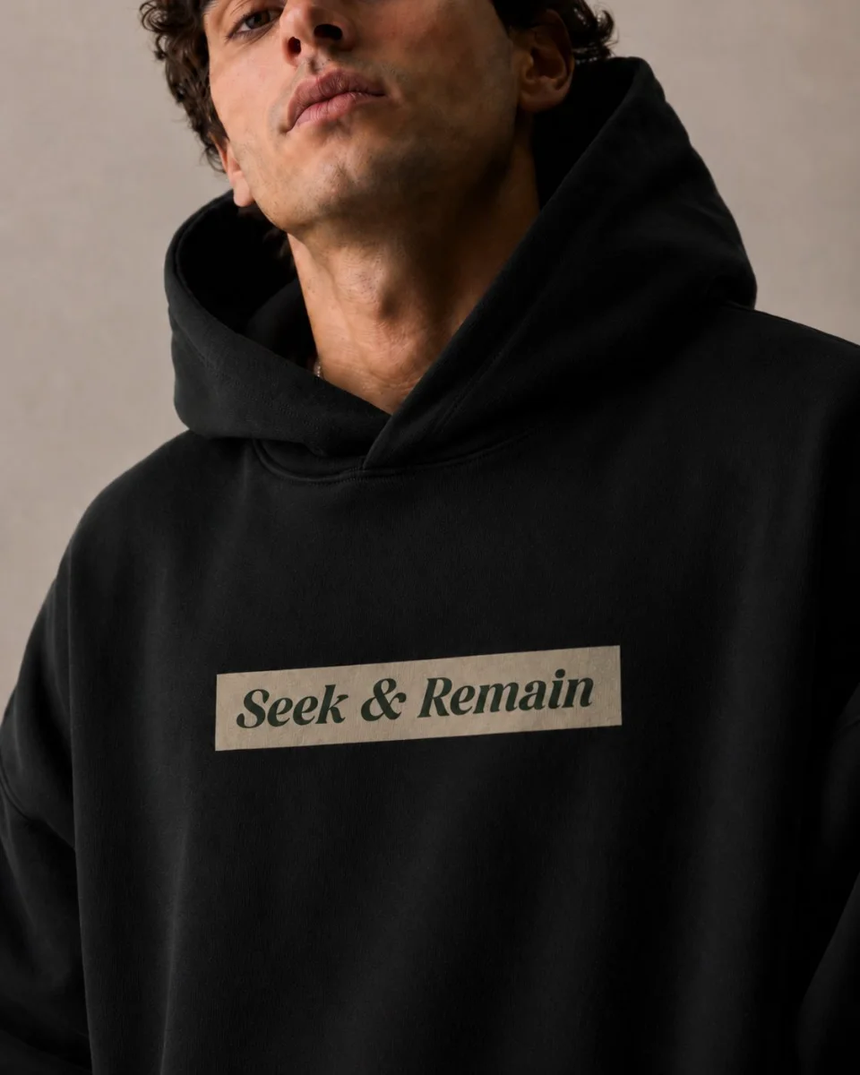
Seek & Remain is an apparel label with scripture in its bones — the name leans on seek first and remain in me, worn on the chest instead of preached from a stage. It needed a wordmark that felt considered, not slapped on a blank.
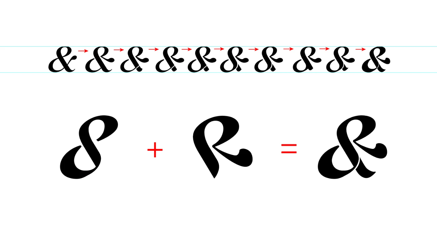
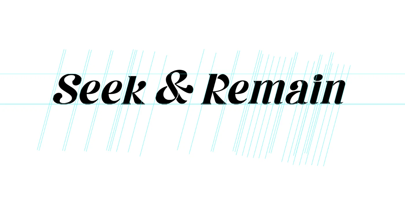
The brief was a wordmark, but the wordmark came down to one glyph. I drew a custom high-contrast italic serif — sharp, editorial, a little devotional — then spent the real time on the ampersand. It's built by fusing the brand's own S and R, so the mark that joins the two words is literally made of both.
Every letter sits on one shared slant grid, so the italic keeps its rhythm at any size — from a woven neck label to an oversized chest print.
The connector isn't borrowed from a typeface — it's the two initials, redrawn and folded into each other until they read as one.
S + R = & — the ampersand built from the brand's own initials
Every letter drawn to one shared slant grid
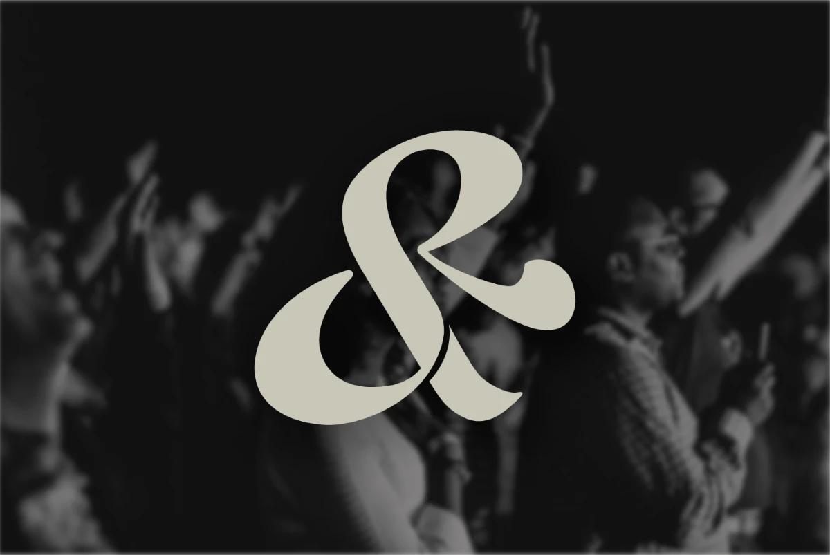
One character, carrying the whole name.
Box-logo hoodie — applied chest print
02
Case Study
Renova Recovery.
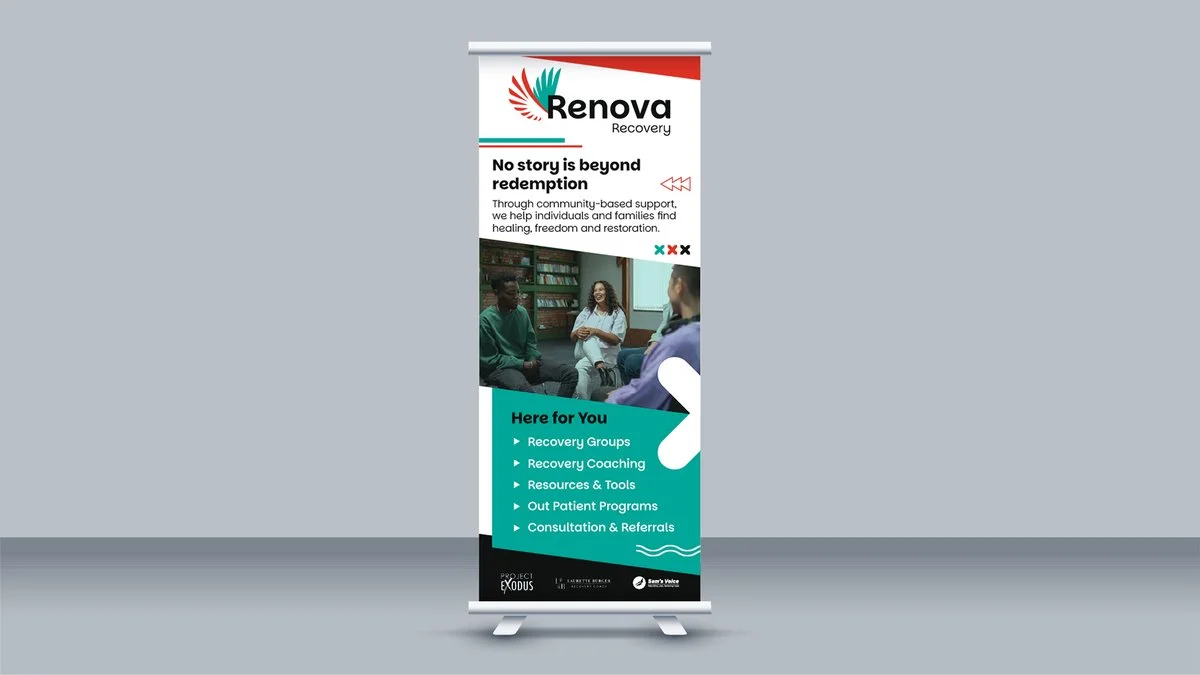
A community recovery centre in Durban — built as one brand system that had to hold together across screens, shirts, and street.
Brand IdentityApparelPrintDigital
Renova Recovery runs trauma-informed outpatient support for people rebuilding their lives after addiction — recovery groups, coaching, youth intervention — out of Bluff, on Durban's south coast. They needed a brand that could carry real weight without feeling clinical.
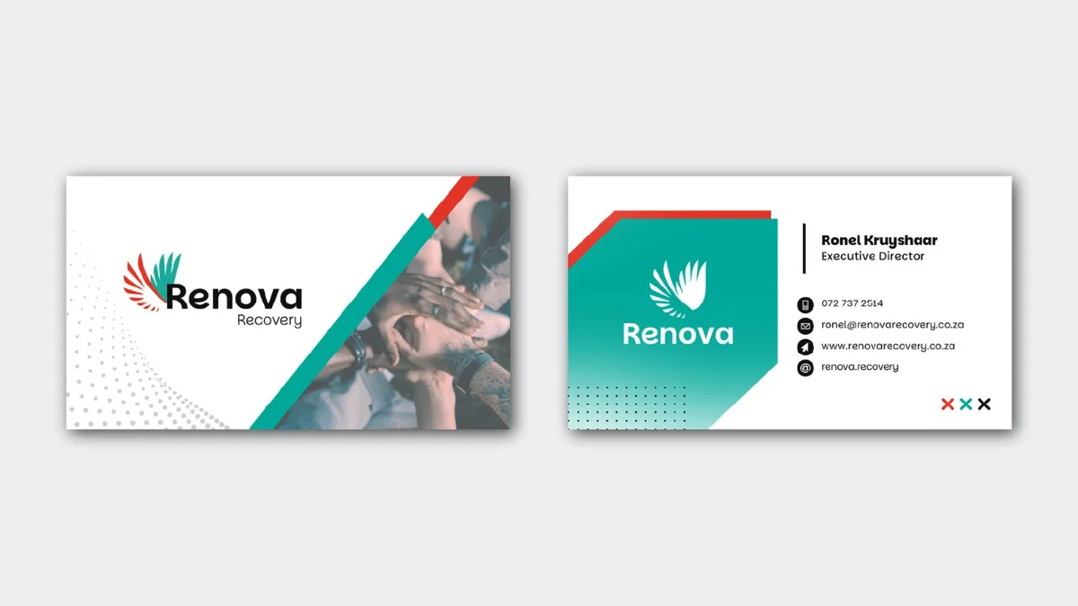
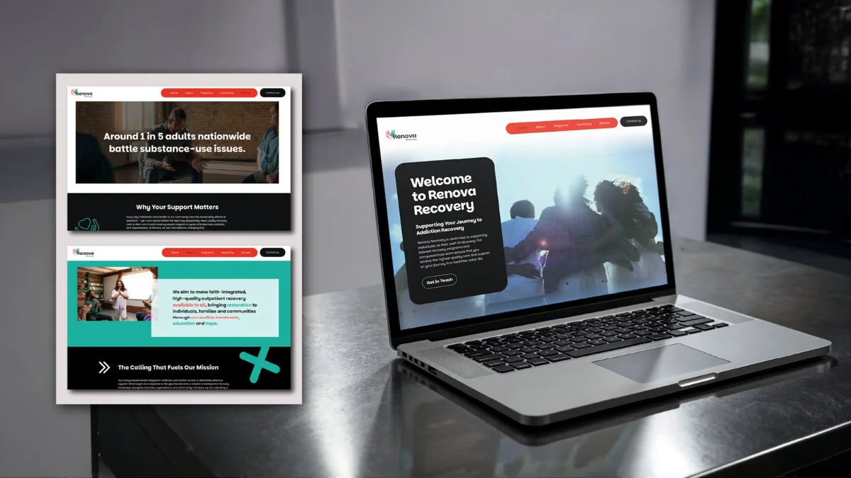
I built the identity from the ground up: the wing mark, the colour system, and then every touchpoint that had to use it afterward. The goal was never just a logo — it was a system that still reads as Renova whether it's on a hoodie or a donor's business card.
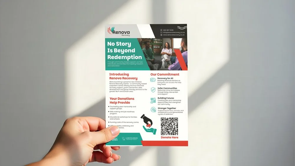
Ongoing marketing material is part of the deal too, so the system keeps getting tested against new formats — flyers, banners, whatever the next campaign needs.
Business cards · Website · Pull-up banner · Flyer — one system, four formats
03
Case Study
Sam's Voice.
A sober living home in Bluff, Durban. A logo that had to mean something, not just look like something.
Brand IdentityLogo DesignMotionPrint
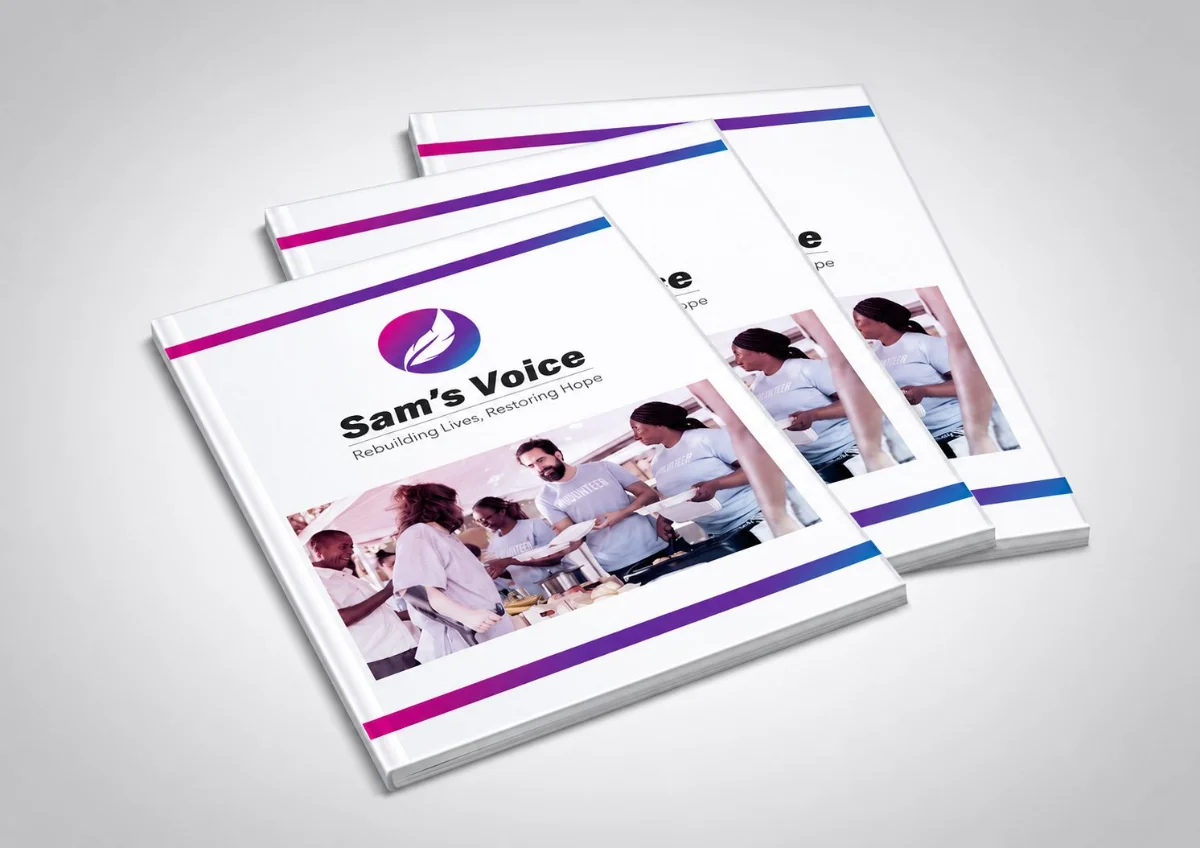
Sam's Voice is a registered Public Benefit Organisation and sober living home — built on faith, structure, and second chances. The name comes from Samantha, the founder's daughter, whose story is the actual reason the organisation exists.
That's the brief I was really working with: build a mark that carries her name properly. The feather is the emotional core — an honouring, not a decoration. The circle around it is the ecosystem Sam's Voice builds for everyone who comes through its doors after her.
Named for Samantha. Built to speak for everyone who comes after her.
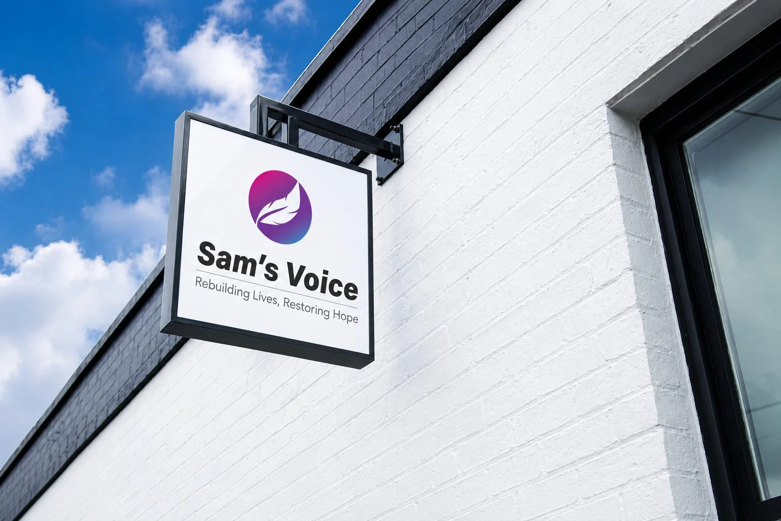
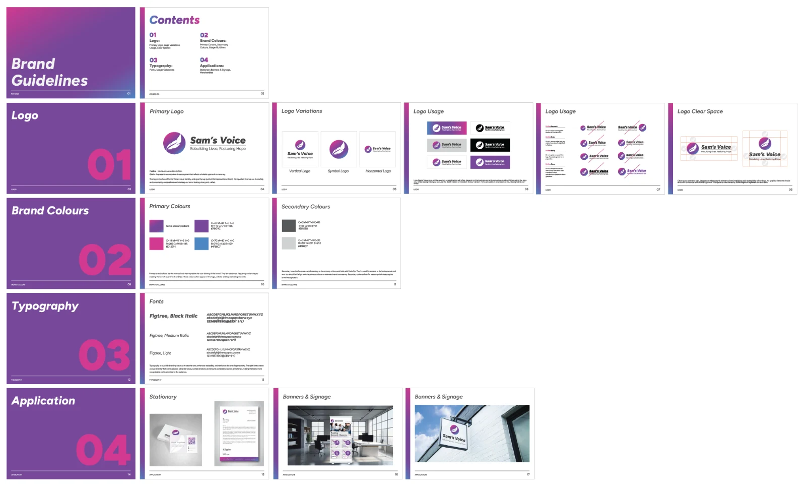
I delivered the full identity plus a proper brand guidelines document — logo usage, colour system, typography, real application mockups — so the mark doesn't drift the moment someone else touches it.
Logo system · Full brand guidelines · Signage, print & digital applications
I still run their ongoing social and video content, including the brand film that opens with this mark coming to life.
Brand film — logo reveal & ongoing content
04
Case Study
Invicta Signs.
A sign company whose own logo didn't look like anyone had made it by hand — for a company that builds signage for a living.
Logo DesignBrand IdentityMotion
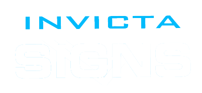
Invicta Signs came to me with a wordmark that did the job and nothing else — flat, generic, the kind of logo that could've belonged to any business in any industry. They wanted something that could actually stand up against their competitors.
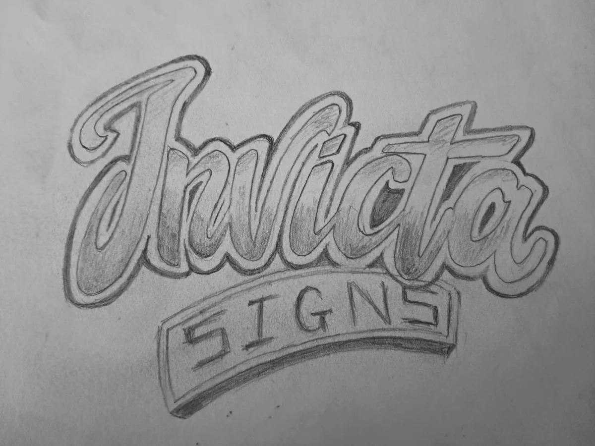
I redrew it by hand first — graffiti-lettering technique, pencil before anything touched a screen — then rebuilt it as a chrome, bevelled mark with enough presence to earn its place on a sign company's own signage.
Before
→
After
A logo built to move as well as sit still — animated for use across their digital channels.